Next.js Forms with Server Actions

As of Next.js 14, server actions are stable and are an excellent pattern for implementing forms in web applications. As documented on the Next.js website, server actions are asynchronous functions executed on the server and can be triggered by a form submission. Although the documentation provides ample information on using server actions, there's limited guidance on effectively using them with forms, including handling accessibility and validation. Before the introduction of server actions, I often would lean on solutions such as react-hook-form to address these requirements. Through experimentation, I discovered a solution that not only leverages the capabilities of server actions but also provides a lightweight approach to form handling. In this article, I'll share my insights on integrating server actions seamlessly with forms in Next.js applications.
Upon embarking on my quest for an off-the-shelf form experience, I first turned to shadcn ui. Unlike traditional component libraries, shadcn ui is not installed as a dependency but instead adds components directly to your project source using its CLI. By not making itself a dependency, shadcn ui affords complete flexibility to customize and tweak to your needs. Leveraging frameworks like radix ui and tailwind css internally, shadcn ui provides a versatile selection of components for building user interfaces.
Upon examining the shadcn ui Form component, I discovered that it relies on react-hook-form for its core functionality and zod for validation. While react-hook-form is a popular choice for client-side form handling, it does not align well with server actions due to its client-side submission approach. Additionally, while zod offers robust validation capabilities, it introduces significant overhead to the client bundle, which may impact performance.
After exploring shadcn ui's dependencies, I turned to radix ui for a potential solution and discovered its Form component. While still in preview, the Form component offers a promising feature set that makes it more than workable in its current state. Key features include:
- Built on top of the native browser constraint validation API.
- Supports built-in validation.
- Supports custom validation.
- Full customization of validation messages.
- Accessible validation messages.
- Supports client-side and server-side scenarios.
- Focus is fully managed.
Despite its preview status and the possibility of API changes in the future, I found the radix ui Form component to be a viable option for integrating server actions with forms in Next.js applications. With the radix Form component identified as a promising solution that seamlessly integrates with server actions, let's delve into the implementation details. To get started, we need to install the radix form component:
npm install @radix-ui/react-formIn line with shadcn ui conventions, we'll organize our form components inside
the components/ui directory. To begin, create the file
src/components/ui/form.tsx. The first form components we'll handle are those
that will be re-exported without applying any customization. Those are
FormControl and FormValidityState.
'use client';

import * as Form from '@radix-ui/react-form';

const FormControl = Form.Control;
const FormValidityState = Form.ValidityState;

export { FormControl, FormValidityState };
FormControl wraps the input element. Examples could be <input>, <select>,
or <textarea>. While FormValidityState takes a render prop of the field
validity status. This is for advanced use cases and won't be needed in this
example.
The next component we'll handle is FormMessage which is shown for validation
errors. We don't need to customize its functionality but we will apply some
styling using twc.
import * as Form from '@radix-ui/react-form';
import { twx } from '@/lib/utils';

const FormMessage = twx(Form.Message)`text-sm font-medium text-destructive`;
FormMessage.displayName = 'FormMessage';
twx is a utility function that combines twc
with tailwind-merge. twc is handy
library for projects using tailwind as it will forward refs, merge classnames,
and composes with its children when asChild is set. It's essentially a
replacement for the below boilerplate had we not used twc.
function FormMessage({
  className,
  asChild = false,
  ...props
}: React.HTMLAttributes<HTMLSpanElement> & { asChild?: boolean }) {
  const Comp = asChild ? Slot : 'span';

  return (
    <Comp
      data-slot="form-message"
      className={clsx('text-destructive text-sm font-medium', className)}
      {...props}
    />
  );
}
clsx by itself doesn't handle conflicts between tailwind styles so we create a
custom version of twc using tailwind merge and name that utility twx.
import { twMerge } from 'tailwind-merge';
import { createTwc } from 'react-twc';

export const twx = createTwc({ compose: cn });
As a tip, add the below config to your vscode settings as it will allow for hover previews of the css utilities when using the tailwind vscode extension.
{
  "tailwindCSS.experimental.classRegex": [
    "twx\\.[^`]+`([^`]*)`",
    "twx\\(.*?\\).*?`([^`]*)",
    ["twx\\.[^`]+\\(([^)]*)\\)", "(?:'|\"|`)([^']*)(?:'|\"|`)"],
    ["twx\\(.*?\\).*?\\(([^)]*)\\)", "(?:'|\"|`)([^']*)(?:'|\"|`)"]
  ]
}
The first custom component we'll create is the FormRoot. Internally it'll
render a <form> element and will accept an action prop that we will pass our
server action to. In order to provide the server validation state to children,
we'll create FormContextValue that will contain an errors record property of
all error messages returned by the server. With the React hook
useFormState, we
are able to get the return value of a server action. That returned value is then
provided through context to be used by our remaining components.
type FormContextValue = { errors: Record<string, string[] | undefined> };

const FormContext = React.createContext<FormContextValue>({ errors: {} });

type FormRootProps = Omit<
  React.ComponentPropsWithoutRef<typeof Form.Root>,
  'action'
> & {
  action: (
    state: FormContextValue,
    formData: FormData,
  ) => Promise<FormContextValue>;
};

function FormRoot({ action, ...props }: FormRootProps) {
  const [state, formAction] = useFormState(action, { errors: {} });

  return (
    <FormContext.Provider value={state}>
      <Form.Root data-slot="form-root" {...props} action={formAction} />
    </FormContext.Provider>
  );
}
FormRoot.displayName = 'FormRoot';
For the FormField component, we're going to get the form context value and if
there were any errors returned by the server for that field, we'll render
FormMessages for each error.
function FormField({
  className,
  children,
  ...props
}: React.ComponentProps<typeof Form.Field>) {
  const state = React.useContext(FormContext);

  return (
    <Form.Field
      {...props}
      data-slot="form-field"
      className={cn('space-y-2', className)}
      serverInvalid={Boolean(state.errors[props.name])}
    >
      {children}
      {state.errors[props.name]?.map((error) => (
        <FormMessage key={error}>{error}</FormMessage>
      ))}
    </Form.Field>
  );
}
FormField.displayName = 'FormField';
Next we're going to create the FormLabel. We're going use shadcn ui's own
Label component so make sure to install that first with
npx shadcn-ui@latest add label. In this implementation, we utilize radix ui's
behavior of setting the data-invalid attribute on field elements when they are
invalid. This allows us to dynamically apply the text-destructive Tailwind
utility to the Label component when the field is invalid, indicating an issue
to the user.
import * as React from 'react';
import * as Form from '@radix-ui/react-form';
import { cn } from '@/lib/utils';
import { Label } from '@/components/ui/label';

function FormLabel({
  className,
  ...props
}: React.ComponentProps<typeof Label>) {
  return (
    <Form.Label asChild>
      <Label
        {...props}
        data-slot="form-label"
        className={cn('data-invalid:text-destructive', className)}
      />
    </Form.Label>
  );
}
FormLabel.displayName = 'FormLabel';
To finalize our form components, let's define the FormSubmit button. Similar
to previous components, we'll utilize a shadcn ui Button component, which can
be installed with npx shadcn-ui@latest add button. As an enhancement, we'll
include a loading spinner to indicate form submission. This can be achieved
using the
useFormStatus
hook provided by react-dom, which tracks the status of form submissions. This
hook must be used in a component that's a child to a <form> element and
returns the status of a form including if submission is pending.
import { Loader2 } from 'lucide-react';
import * as React from 'react';
import { useFormStatus } from 'react-dom';
import * as Form from '@radix-ui/react-form';
import { cn } from '@/lib/utils';
import { Button } from '@/components/ui/button';
function FormSubmit({
className,
children,
...props
}: React.ComponentProps<typeof Button>) {
const status = useFormStatus();
return (
<Form.Submit asChild>
<Button
{...props}
data-slot="form-submit"
className={cn('mt-4', className)}
>
{status.pending && <Loader2 className="mr-2 size-4 animate-spin" />}
{children}
</Button>
</Form.Submit>
);
}
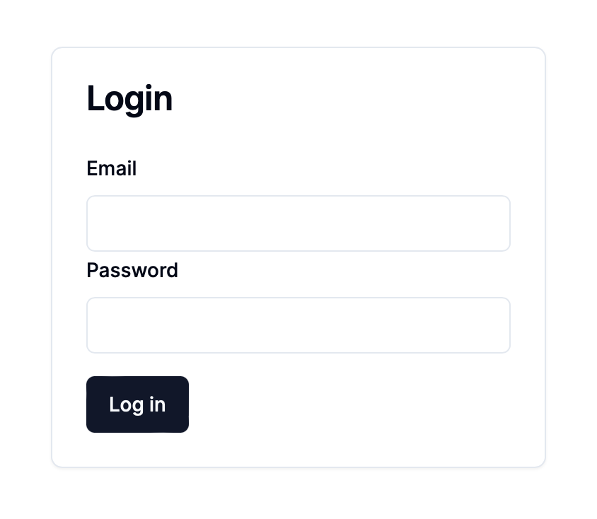
FormSubmit.displayName = 'FormSubmit';With that, we're ready to start implementing our form. For this example, let's implement a simple login form that takes an email and a password.
We're going to start with the server action implementation as we're going to use it with our form. zod will be used for validation but as it's being used within a server action it won't be included in the client bundle. If the correct email and password are provided, the user will be redirected to a new page. Otherwise we will return an object with the error messages to show to user keyed by the field name. For the purpose of this demonstration we'll use a hardcoded email and password.
'use server';

import { redirect } from 'next/navigation';
import { z } from 'zod';

const schema = z.object({
  email: z.string().trim().email(),
  password: z.string().trim().min(1),
});

export type Result = {
  errors: {
    email?: string[];
    password?: string[];
  };
};

export async function login(
  _previousState: Result,
  data: FormData,
): Promise<Result> {
  // one second delay to demonstrate the loading spinner
  await new Promise((resolve) => setTimeout(resolve, 1000));

  const parseResult = schema.safeParse(Object.fromEntries(data.entries()));

  // if parse validation failed, return flattened errors
  if (!parseResult.success) {
    return { errors: parseResult.error.flatten().fieldErrors };
  }

  const { email, password } = parseResult.data;

  // simple example with hardcoded allowed email and password. All others will
  // be invalid
  if (email !== 'admin@example.com') {
    return { errors: { email: ['Invalid email'] } };
  }

  if (password !== 'admin') {
    return { errors: { password: ['Invalid password'] } };
  }

  // If correct email and password are provided, redirect to a new page
  redirect('/dashboard');
}
As our server action is wrapped client side with useFormState, the first
argument to the action is the previous state from the prior invocation. As we
won't be needing that, we'll prefix it with an underscore. Then as the 2nd
argument, we receive the FormData which is a container of all input values
submitted with the form. Each value can be looked up by the associated name
property of the input. As an easier solution, we'll convert it to a plain object
using
Object.fromEntries.
Validation errors will be handled by zod by first flattening the result and then returning the error messages keyed by the field name. These will map to the input names to show error messages if needed. In order to customize the error message, zod validators optionally take a message as their parameter that will be substituted.
z.string().trim().email('You must provide a valid email');For implementing the form, we'll use all the form elements we've created along with the server action previously defined. Note that this component can be rendered as a server component as all the client-side interactivity is isolated to the form internals. A good use case for this being a server component is dynamic forms where the fields to show to the user is not known until runtime.
import {
FormControl,
FormField,
FormLabel,
FormMessage,
FormRoot,
FormSubmit,
} from '@/components/ui/form';
import { Input } from '@/components/ui/input';
import { login } from './login-action';
export function LoginForm() {
return (
<FormRoot action={login}>
<FormField name="email">
<FormLabel>Email</FormLabel>
<FormControl asChild>
<Input type="email" required />
</FormControl>
<FormMessage match="valueMissing">Please enter your email.</FormMessage>
<FormMessage match="typeMismatch">
Please provide a valid email.
</FormMessage>
</FormField>
<FormField name="password">
<FormLabel>Password</FormLabel>
<FormControl asChild>
<Input type="password" required />
</FormControl>
<FormMessage match="valueMissing">
Please enter your password.
</FormMessage>
</FormField>
<FormSubmit>Log in</FormSubmit>
</FormRoot>
);
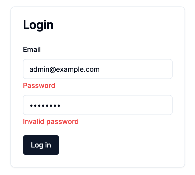
}With that taken care of, it's time to test. If we enter an invalid password, we
can then see that a message is displayed in the UI that the password is invalid.
A similar message would appear if the email is incorrect. However if both the
email and password are correct, we redirect the user to the /dashboard page.
In conclusion, we've built a set of reusable form elements that are compatible with server actions and server components. The form is accessible to screen readers and supports both client and server side validation. As no 3rd party styling is relied upon, all elements can be customized as needed to fit your app brand. Due to the flexibility afforded by the solution, this is how I intend to implement forms in my apps going forward.
The code for this implementation is available on Github and if you'd like to play around with a demo, that can be found here.